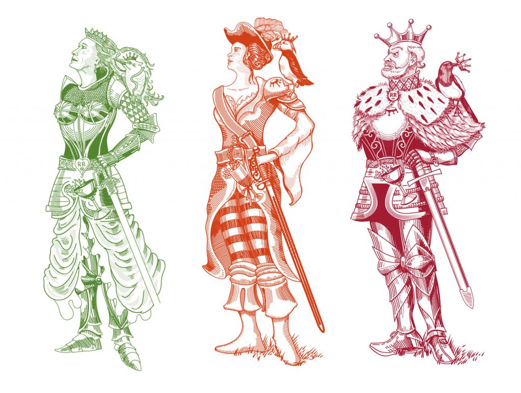
I recently pitched these ideas to a Vermouth brand. I tried to match their existing illustration style which has a woodcut feel to it.
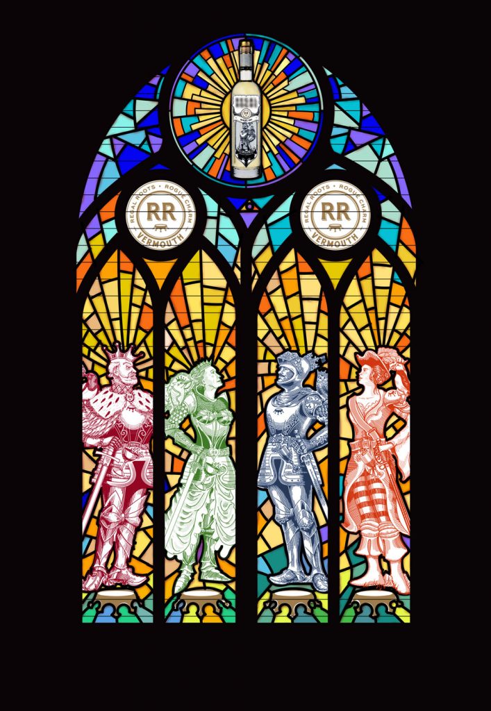
Part of the pitch involved creating a poster and a tissue wrap for the bottle. which can be seen here (the stained glass window images).
Sadly they went with someone else, but luckily there wasn’t a non-disclosure agreement, so I can post this work. Which is fantastic, because I am quite proud of it!
The brand currently uses an image of one rogue-ish knight across all four of their flavours. I expanded on this by creating three new rogues to make a family, including a King, a Queen and a Princess who has run away to become a pirate captain.

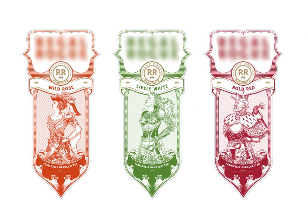
I also created my own version of their label which I drew in Adobe Illustrator. Out of consideration for the brand I have blurred out the logo design/brand name.

And here is the poster design:


Leave a Reply